Best records : graphic / packaging wise
Jun 29, 2012 16:34:37 GMT
Post by Raven X Army on Jun 29, 2012 16:34:37 GMT
So Jeff came up with this sentence in another topic:
 From the cover art to the vinyl colors to the insert, I think this is one of the best looking records ever.

and it made me think what would be my perfect looking record.
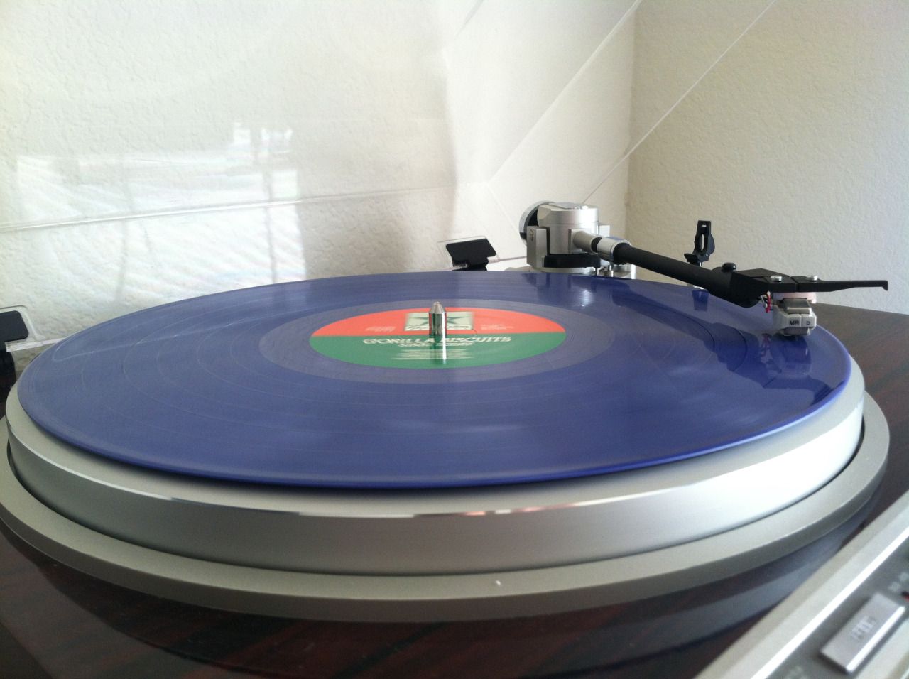
To be quite honest I don't really like what most of the REV releases look like. That GB LP while a great fucking record music wise imo looks retarded from the graphic point of view.
Call me crazy but some of my favourite records have the worst packaging. Take the JUDGE BID LP for an easy example. Who the f. mixes the opposite colours (yellow and purple) and throws in the green vinyl on top of that? Don't think so.
Same thing with the JUDGE NYC 7".. while almost unfuckwithable on Schism REV managed to eff it up. I would be OK with the orange cover but orange cover and blue vinyl combination = not the greatest idea..
Records I like to look at:
I think the gold medal for the most amazing artwork/packaging MUST go to CRASS Records.
They've done it all and as far as I remember there hasn't been a bad looking record in Crass catalogue prior to 1984/1985 when they dropped their working formula and made that Notes on the Summer Day 12". Still not a bad looking record but extremely mediocre when compared to what they did before. And they did it it all.
I mean they REALLY did it all:
- Silkscreened covers (check)
- Fold out poster cover (check)
- Gatefolds (check)
- Boxsets
- Amazing graphics - see Rudimentary Peni for instance or just about any CRASS release (check)
- Inserts in every shape and form imaginable:
a) big inserts (check)
b) small inserts (check)
c) printed inner sleeves (check)
d) big fanzines, small fanzines, postcards, stickers... whatever you can imagine they've done it
- Flexis (check)
- Pins, badges, patches whatever you can think of...
While musically Crass Records catalogue was for the most part hit and miss with either work of genius or a complete fucking disaster I must say that graphically they created something extraordinary keeping the whole thing consistent and recognizable (you could just point at that Andy T 7" and say "That has got to be Crass Records release") but not boring.
The only other label I can think of that spent their time on making their shit look good was Alt Tent with DK releases. Massive Crass influence I would say in how the packaging looked like. Very Crass like collage that Winston was coming up with early on in his career.
Other records that must be mentioned for their good graphic design:
- Anything J. Reid has done for the Pistols
- The Smiths (I'm a sucker for anything pop art/halftone although if overdone it may get a bit boring) and even though their records lacked amazing inserts/extras, the cover designs were usually pretty cool. This pop artish cover design was later on continued successfully by Belle and Sebastian
- Minimalistic designs that are so powerful that get engraved in your brain so that when you wake up every day in the morning that Urban Waste 7" is the first thing that comes to your mind. Followed second close by the Abused 7". Where would we all be without that record I dread to even think.
And to end this on a positive note: almost every record cover made by Pushead is fucking shite.

and it made me think what would be my perfect looking record.
To be quite honest I don't really like what most of the REV releases look like. That GB LP while a great fucking record music wise imo looks retarded from the graphic point of view.
Call me crazy but some of my favourite records have the worst packaging. Take the JUDGE BID LP for an easy example. Who the f. mixes the opposite colours (yellow and purple) and throws in the green vinyl on top of that? Don't think so.
Same thing with the JUDGE NYC 7".. while almost unfuckwithable on Schism REV managed to eff it up. I would be OK with the orange cover but orange cover and blue vinyl combination = not the greatest idea..
Records I like to look at:
I think the gold medal for the most amazing artwork/packaging MUST go to CRASS Records.
They've done it all and as far as I remember there hasn't been a bad looking record in Crass catalogue prior to 1984/1985 when they dropped their working formula and made that Notes on the Summer Day 12". Still not a bad looking record but extremely mediocre when compared to what they did before. And they did it it all.
I mean they REALLY did it all:
- Silkscreened covers (check)
- Fold out poster cover (check)
- Gatefolds (check)
- Boxsets
- Amazing graphics - see Rudimentary Peni for instance or just about any CRASS release (check)
- Inserts in every shape and form imaginable:
a) big inserts (check)
b) small inserts (check)
c) printed inner sleeves (check)
d) big fanzines, small fanzines, postcards, stickers... whatever you can imagine they've done it
- Flexis (check)
- Pins, badges, patches whatever you can think of...
While musically Crass Records catalogue was for the most part hit and miss with either work of genius or a complete fucking disaster I must say that graphically they created something extraordinary keeping the whole thing consistent and recognizable (you could just point at that Andy T 7" and say "That has got to be Crass Records release") but not boring.
The only other label I can think of that spent their time on making their shit look good was Alt Tent with DK releases. Massive Crass influence I would say in how the packaging looked like. Very Crass like collage that Winston was coming up with early on in his career.
Other records that must be mentioned for their good graphic design:
- Anything J. Reid has done for the Pistols
- The Smiths (I'm a sucker for anything pop art/halftone although if overdone it may get a bit boring) and even though their records lacked amazing inserts/extras, the cover designs were usually pretty cool. This pop artish cover design was later on continued successfully by Belle and Sebastian
- Minimalistic designs that are so powerful that get engraved in your brain so that when you wake up every day in the morning that Urban Waste 7" is the first thing that comes to your mind. Followed second close by the Abused 7". Where would we all be without that record I dread to even think.
And to end this on a positive note: almost every record cover made by Pushead is fucking shite.